
DISCOVER PROJECT
EducationCity
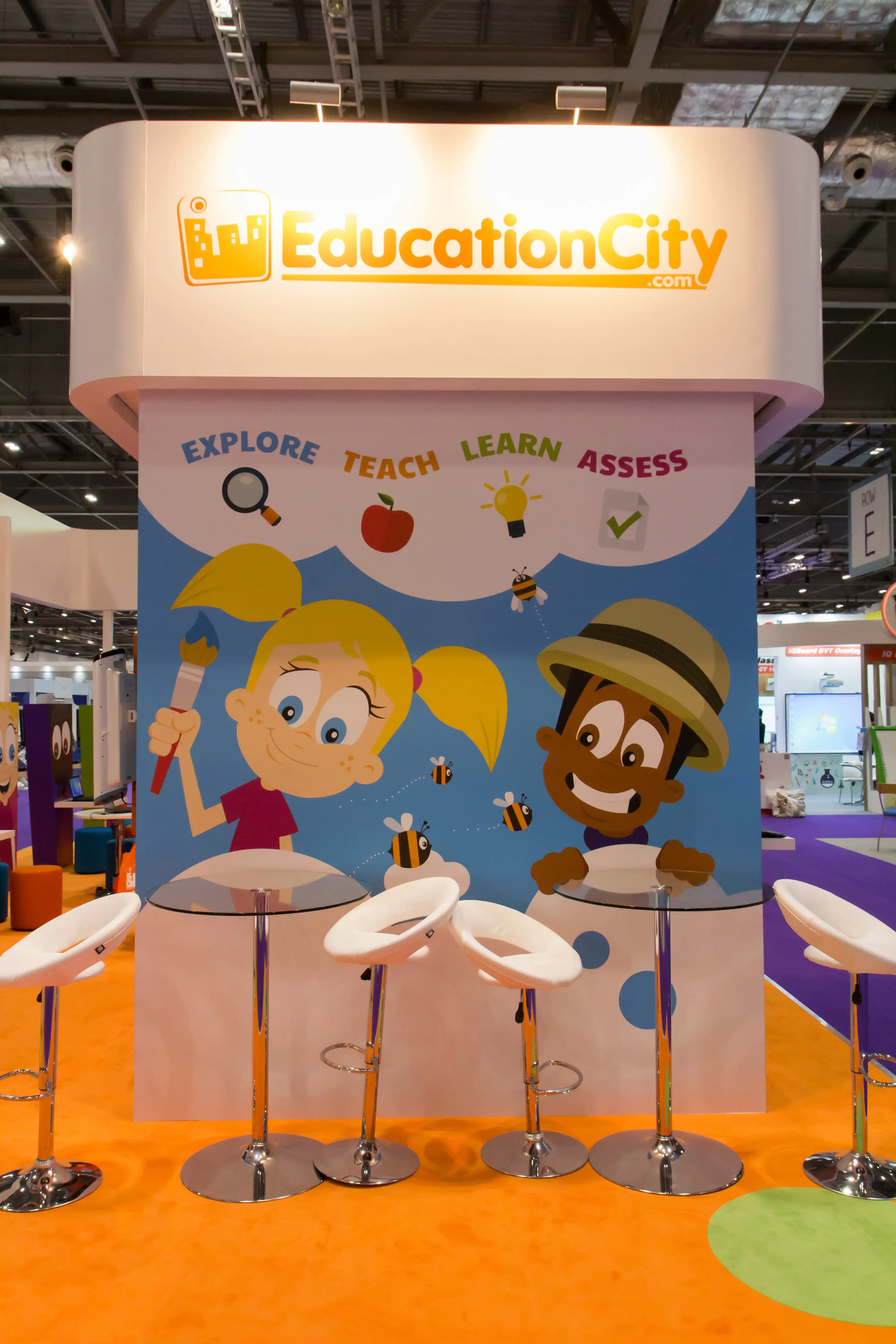
The smallest budget in the room. The most talked-about stand on the floor.
At the world's leading EdTech event, surrounded by Dell, Google, and Microsoft, EducationCity needed to punch above its weight. It did.
SERVICES
BRAND DIRECTION, SPATIAL DIRECTION, EXHIBITION IDENTITY


The moment
BETT is the world's leading education technology event. Hundreds of companies competing for attention from educators, school buyers, and decision makers. The biggest players arrive with the biggest budgets. Floor space, production value, screens the size of walls. EducationCity had a fraction of that budget. But they had something worth saying. The work was to make sure the right people stopped, stayed, and remembered.
The real problem
Budget constraints in an environment like BETT don't just create a design challenge. They create a positioning challenge. A stand that tries to compete with Microsoft on scale will always lose. The direction had to be different. Not louder. More considered. More human. More alive. EducationCity's product is built around learning, engagement, and bringing education to life for children around the world. The stand needed to feel exactly like that. Not corporate. Not cold. The sunshine of the event.
The direction
Every decision came back to one question. Would a teacher or school buyer feel drawn in or passed by? The layout was built around natural visitor flow, creating open invitations rather than barriers. Bold, warm visuals that communicated the brand's energy immediately. Interactive zones that gave the sales team a reason to start a conversation. A spatial identity that felt coherent from every angle on the floor. The stand had to do the work the budget couldn't.


In a room full of enterprise budgets, the brief was simple. Be the one people remember.
What changed
EducationCity didn't just show up at BETT. They won it. Best Exhibition Stand at the world's leading EdTech event, competing against some of the most resourced brands in the industry. The stand gave the sales team energy, gave the brand visibility, and gave EducationCity a presence that matched the quality of what they actually do.


In their words
Best Exhibition Stand. - BETT Show


